NYC coffee shops with great logos and branding
I love coffee. I love coffee shops. I love great branding. And I love NYC. Here’s a list that combines all those things.
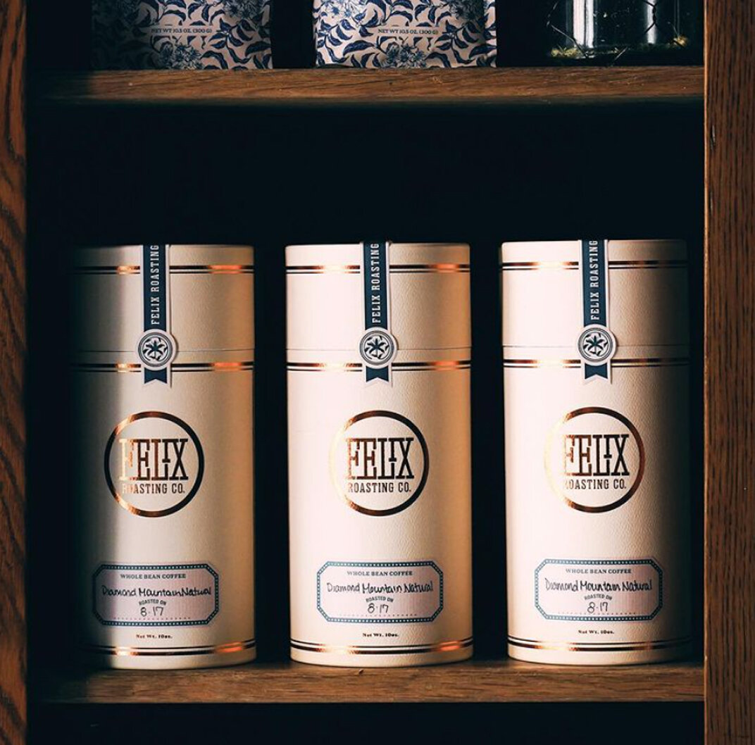
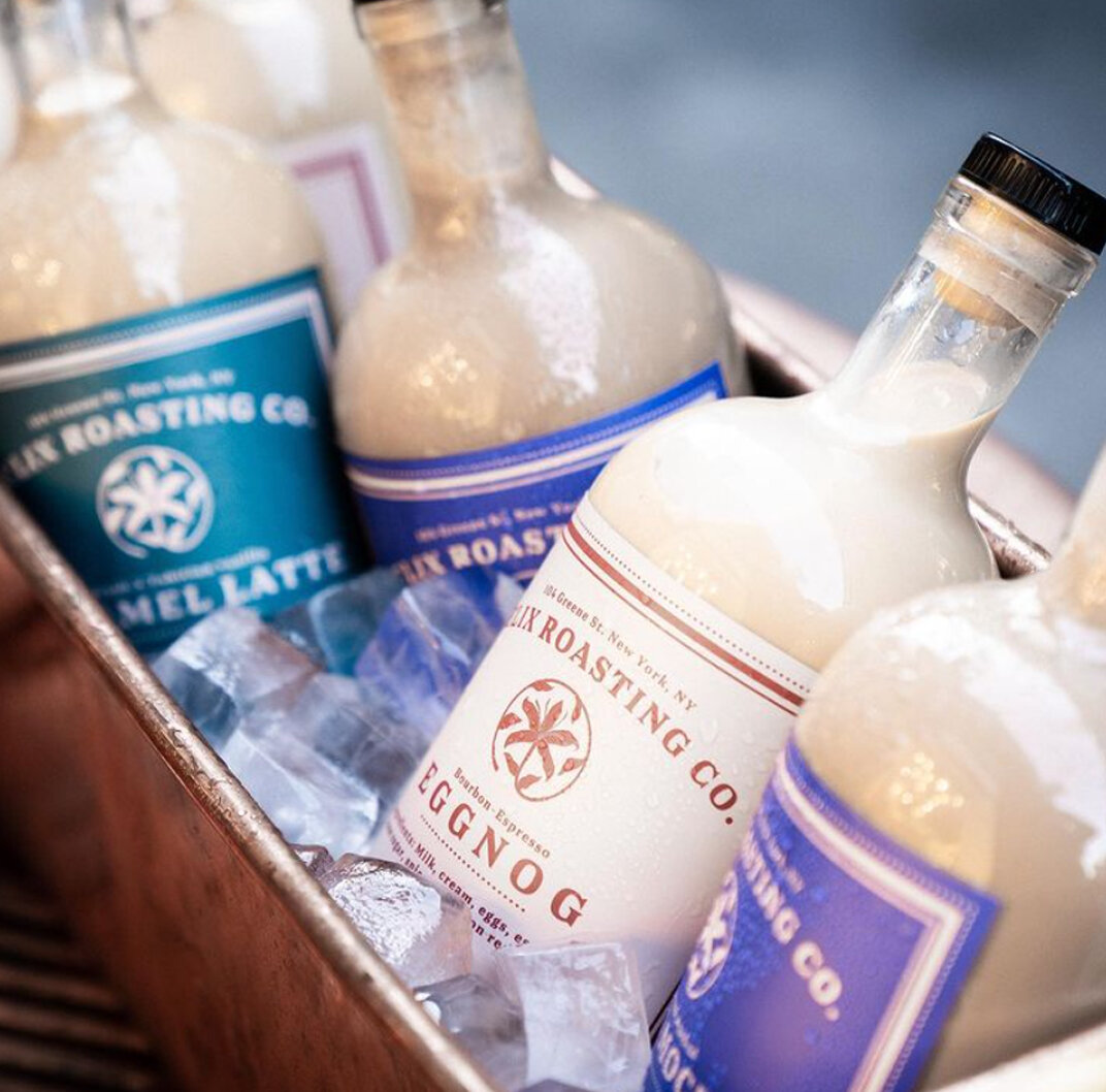
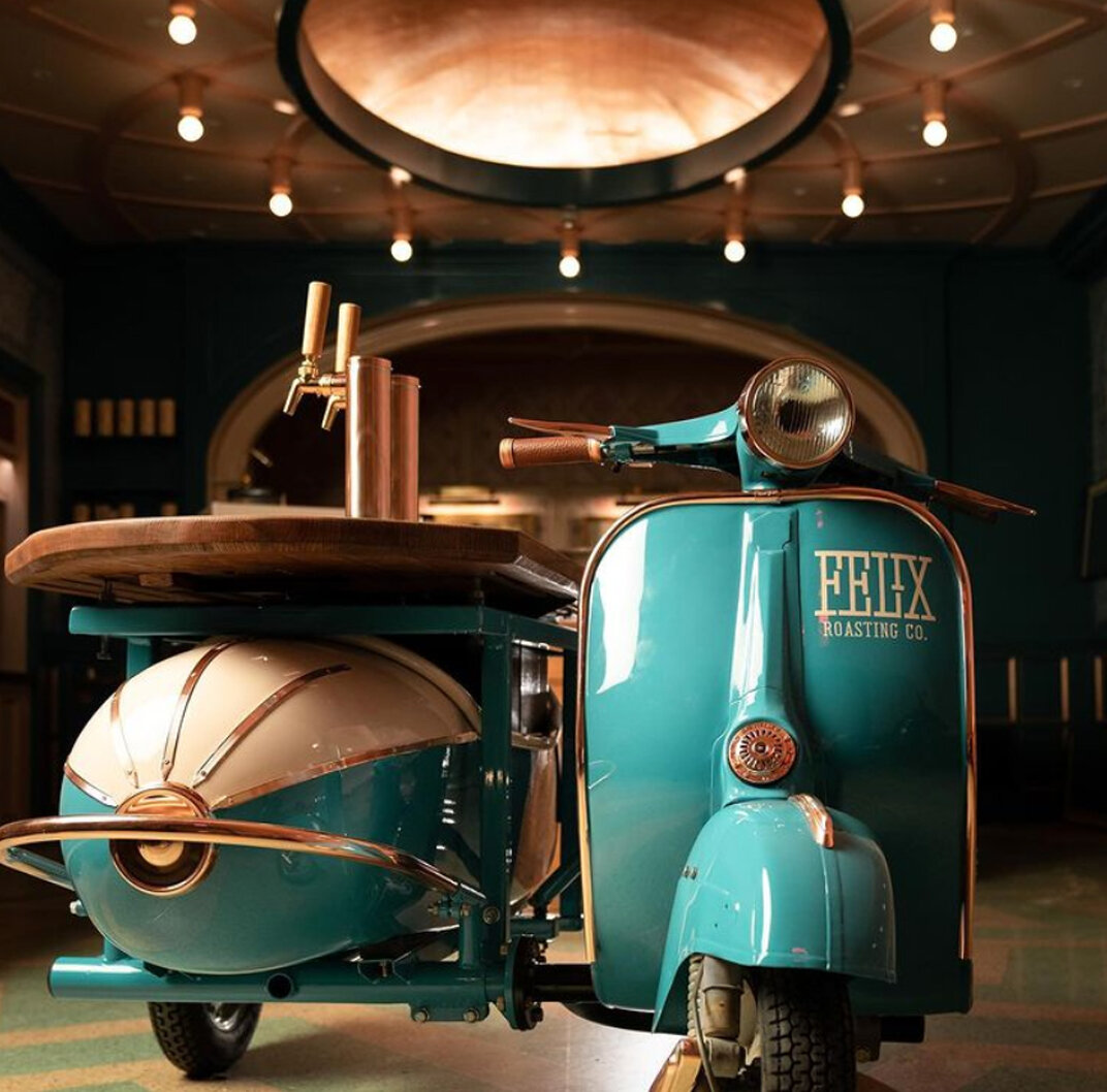
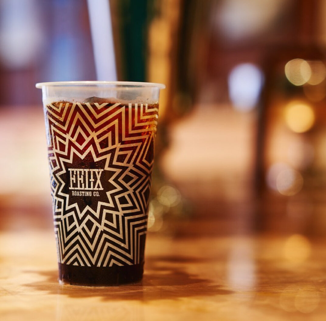
Designed by Elyssa Herman, Felix Roasting Co.’s branding and interiors are a feast for the eyes. The overall look and feel is luxurious, rich and soothing.
Maman, Multiple Locations
Maman’s gorgeous details from the interiors to the cups to the branding are a feast for the eyes. The logo was designed by Alexia Roux and for the cups, textile designer Candice Kaye was brought in. The whole vision is the product of owner Elisa Marshall.
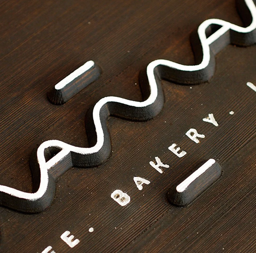
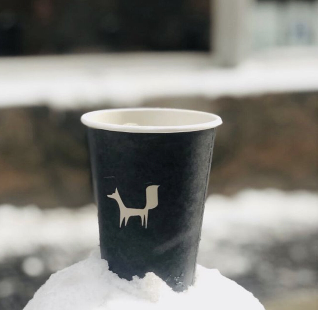
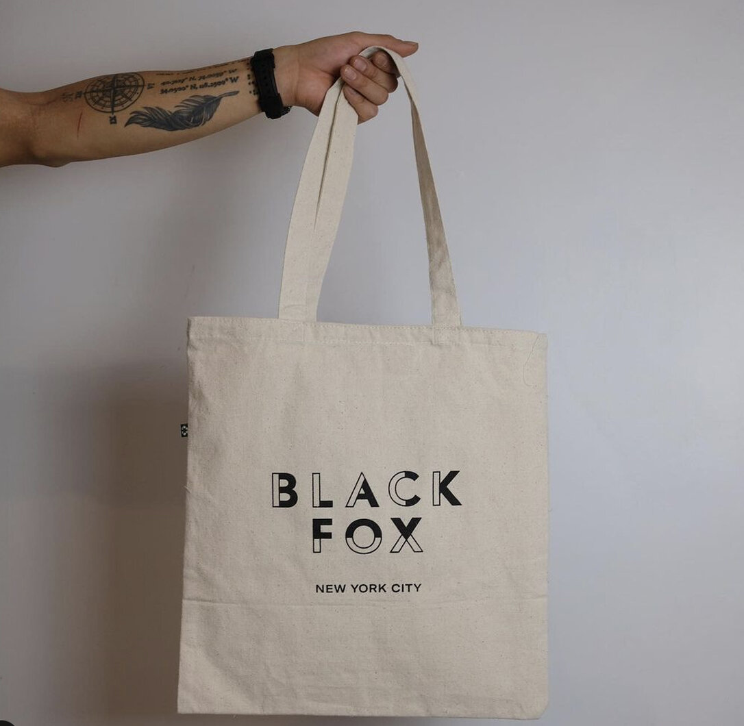
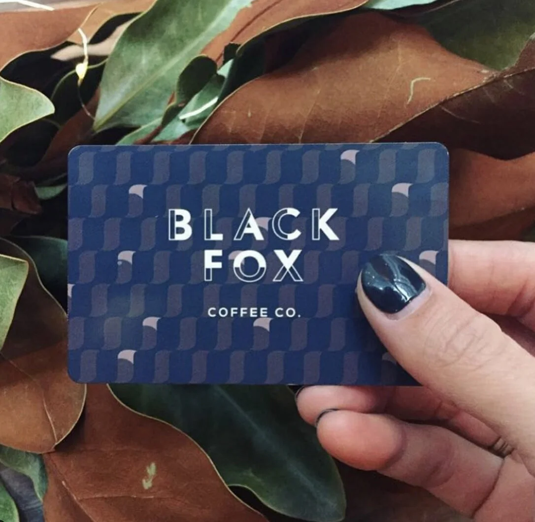
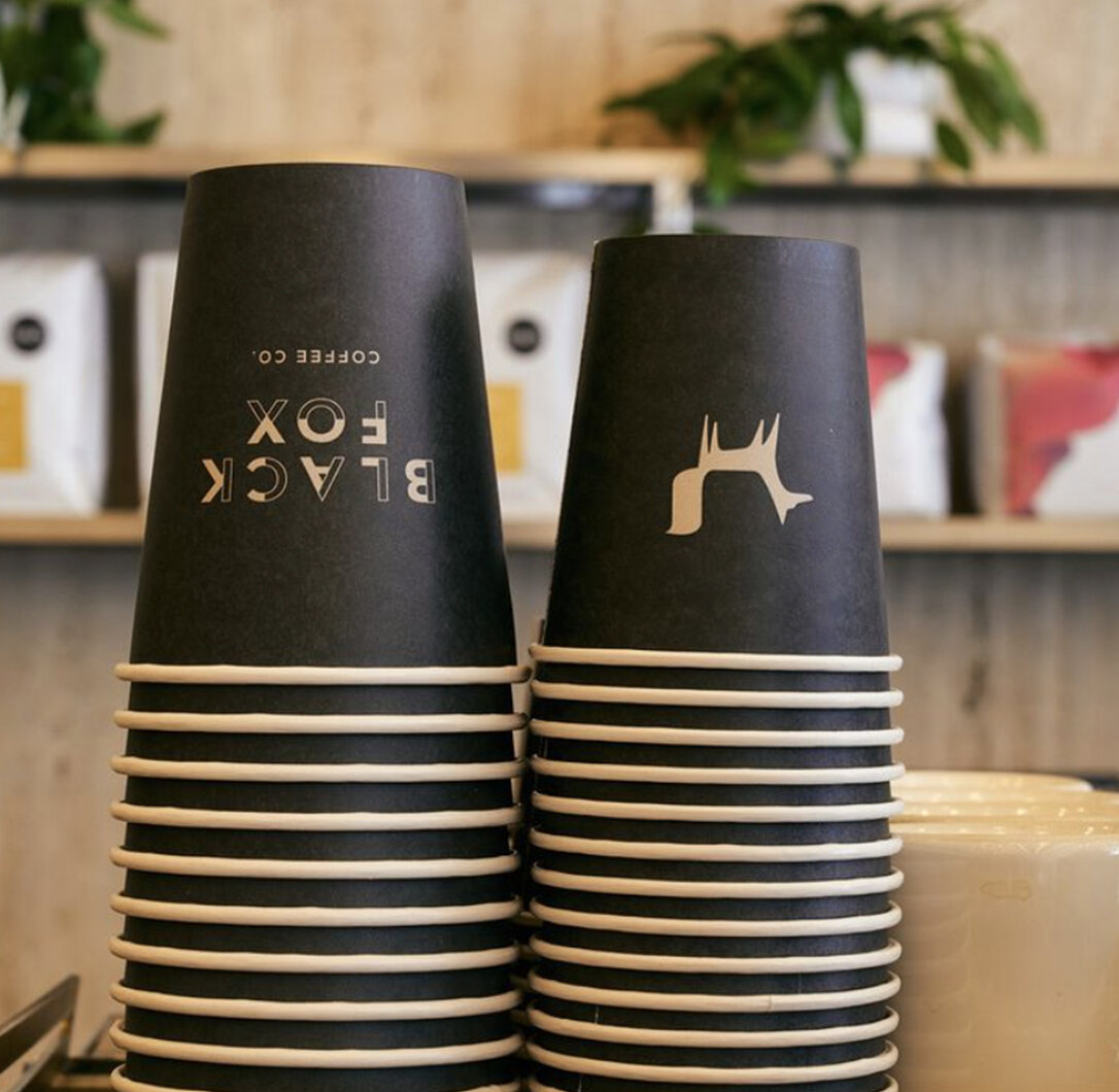
Black Fox Coffee, Financial District
The Black Fox logo designed by Philip Leff uses a subtle geometric pattern in the logotype making for a bold and memorable identity.
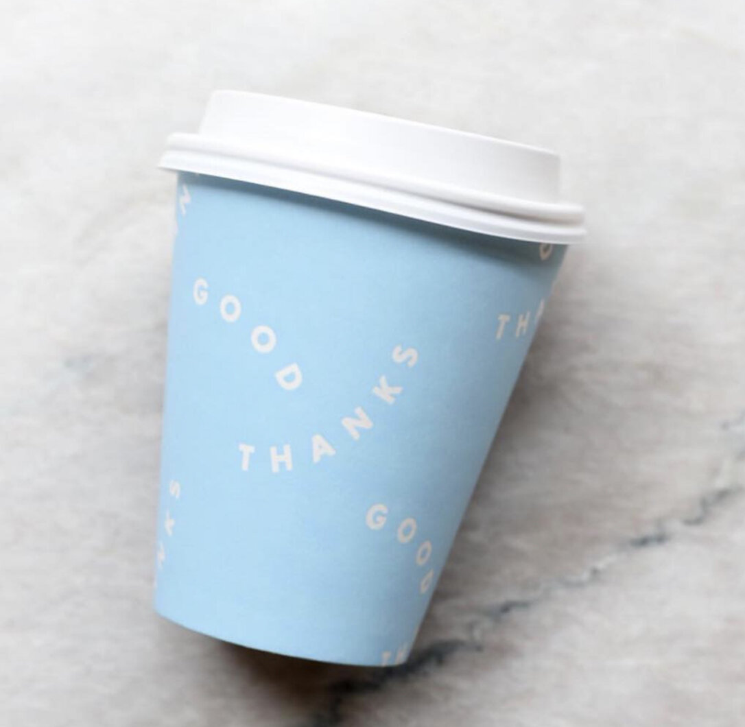
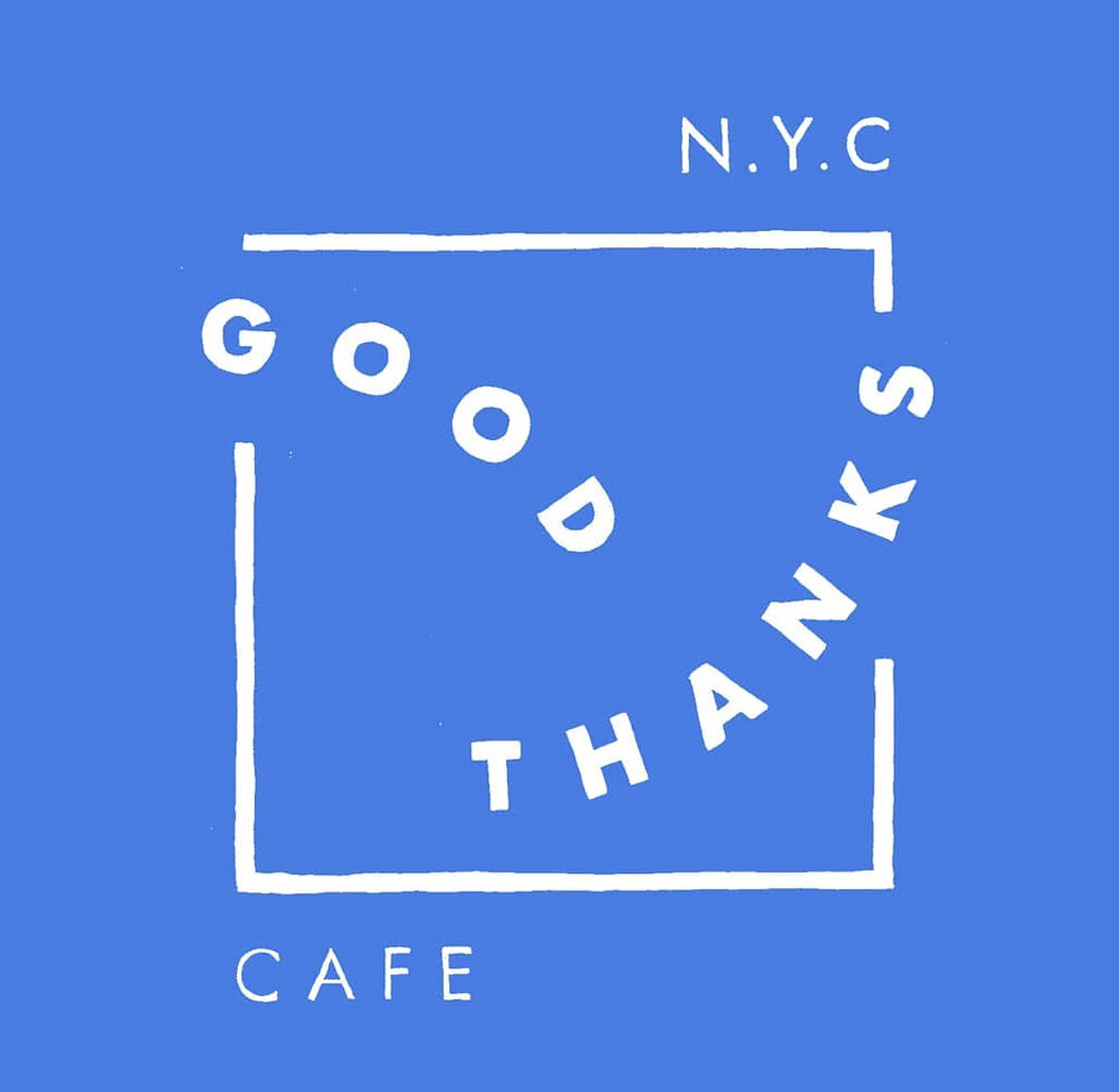
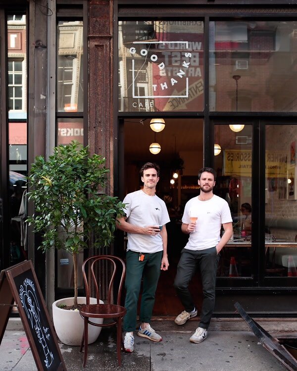
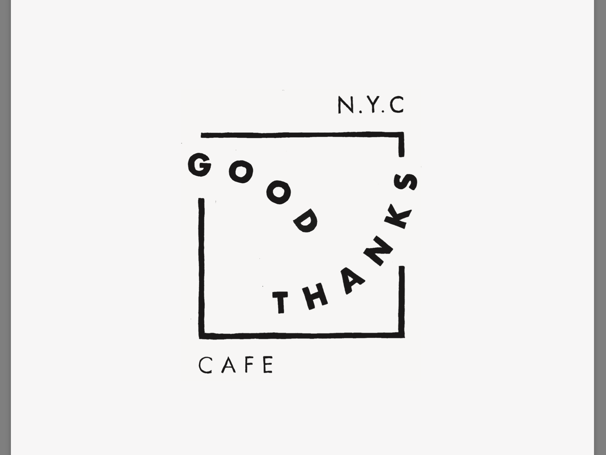
Good Thanks Cafe, LES
Fun and whimsical type make up this logo for Good Thanks Cafe.
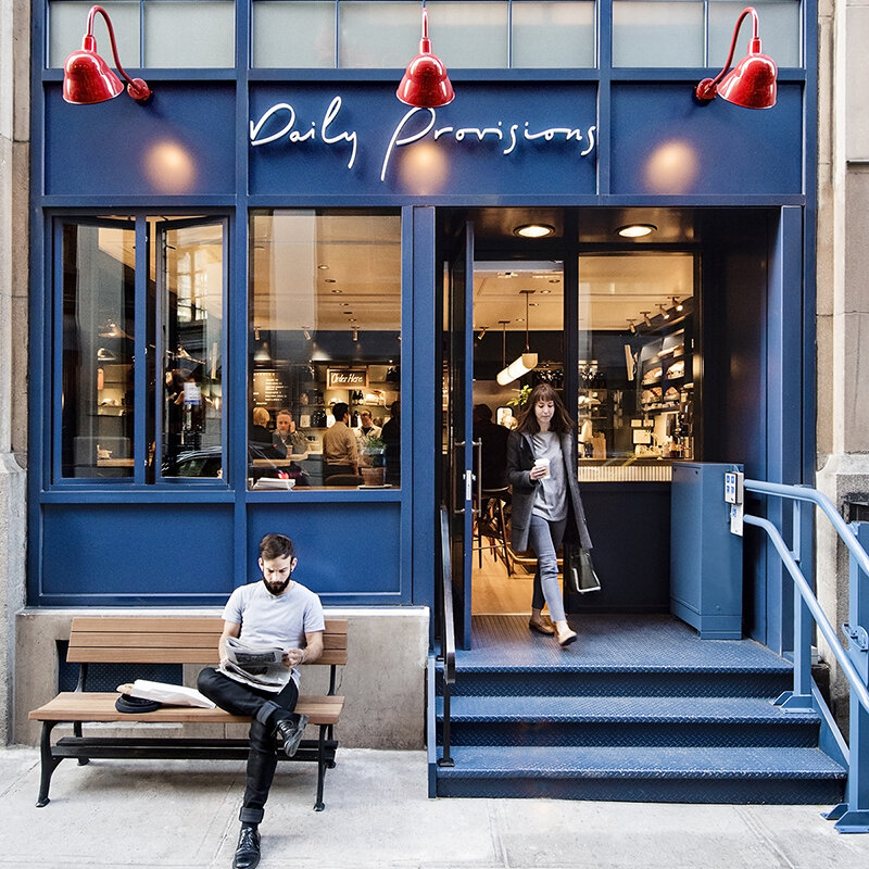
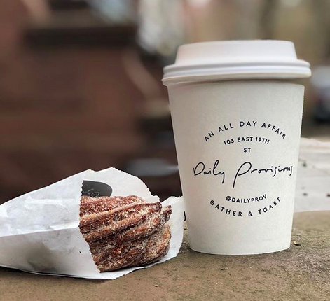
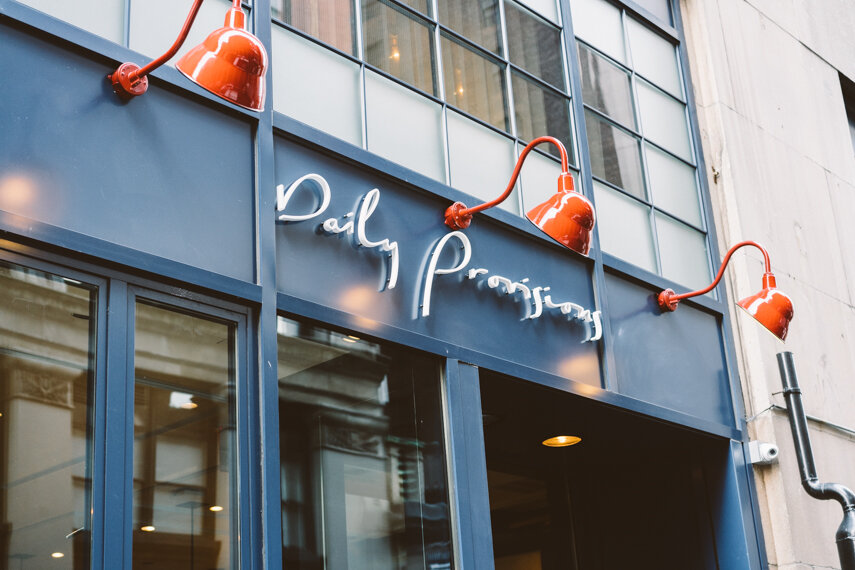
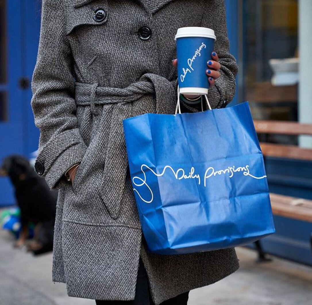
Daily Provisions, Multiple Locations
Handwritten artist Jennifer Lucey-Brzoza makes her mark on the Daily Provisions logo.
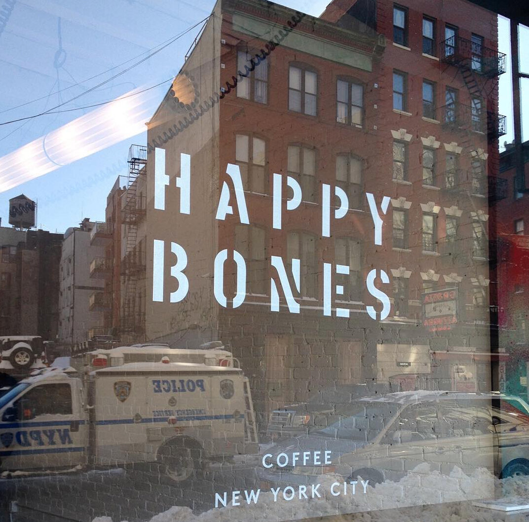
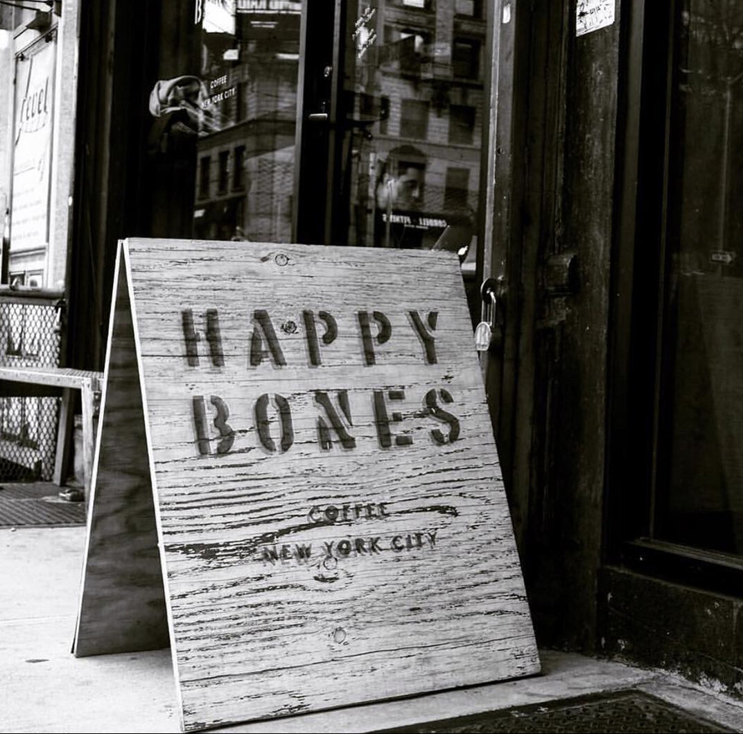
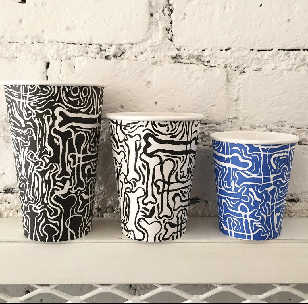
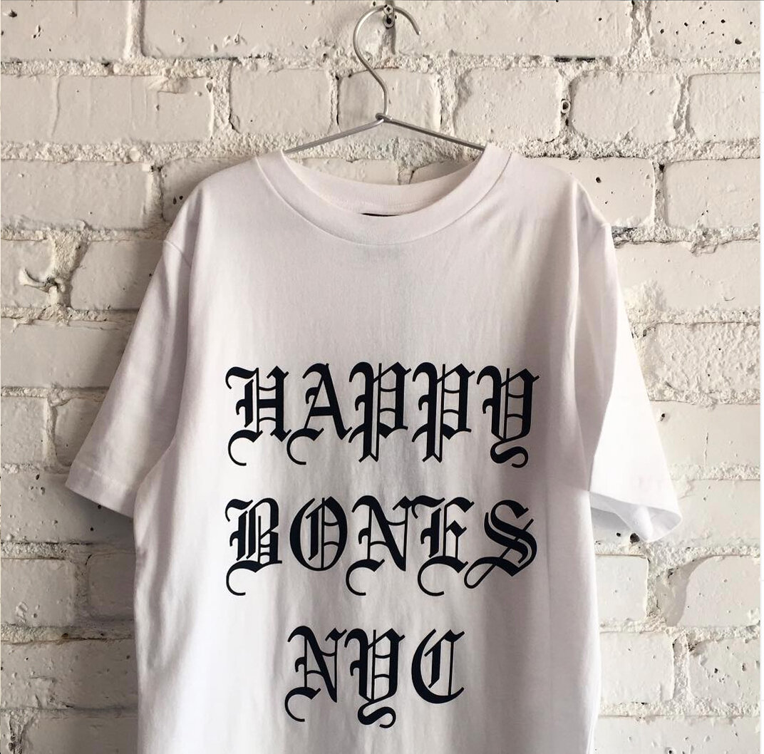
Happy Bones (Closed)
Cool and edgy work by Lotta Nieminen. Unfortunately the coffee shop has closed since this blog post first published.
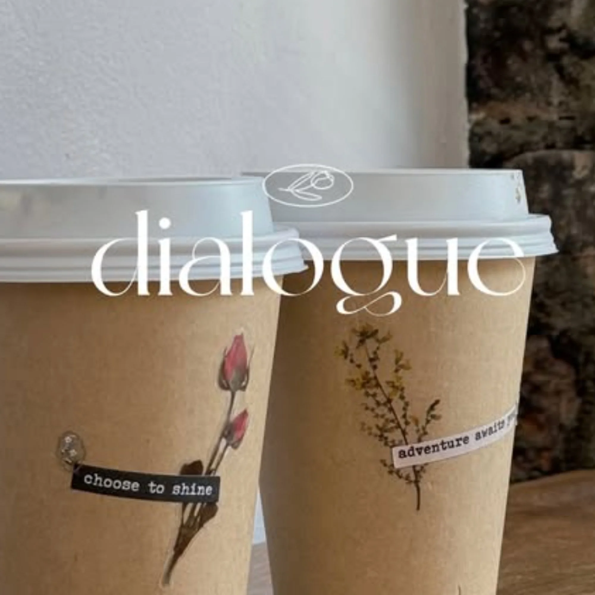
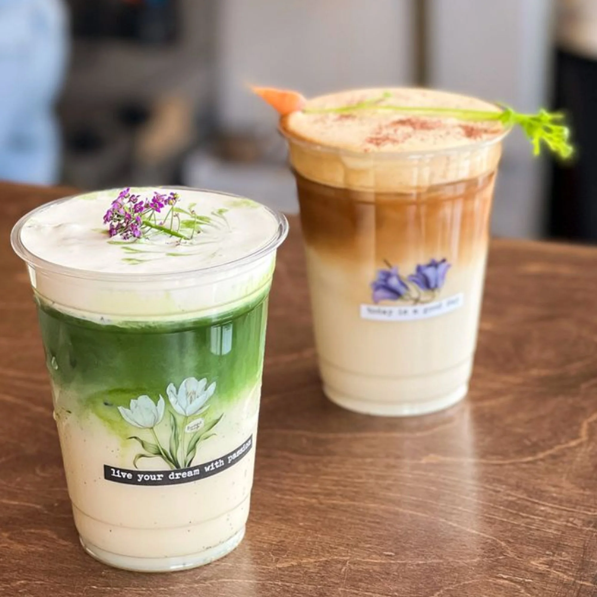
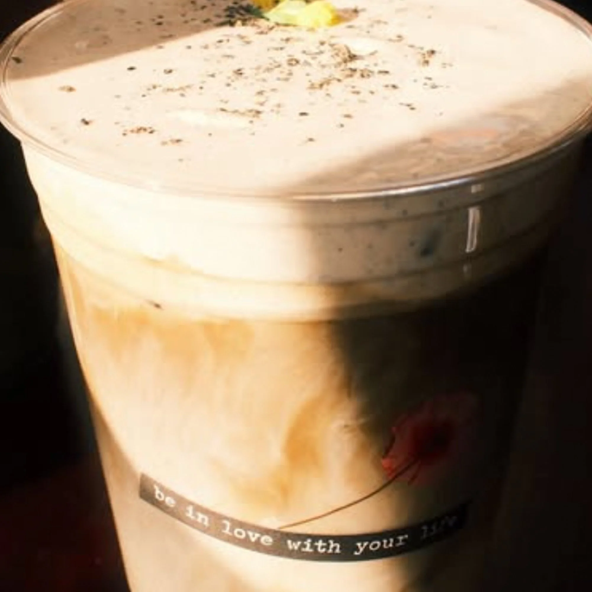
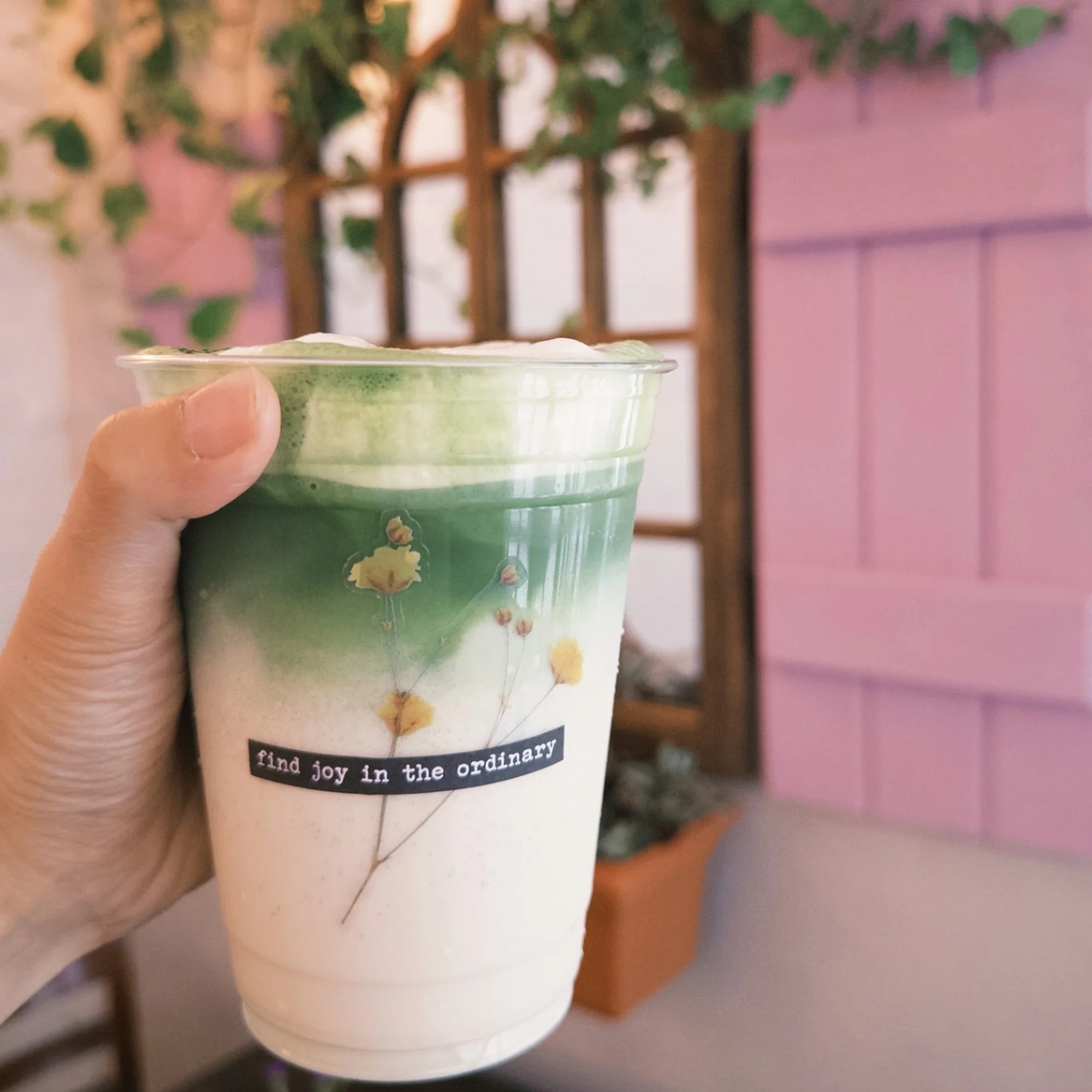
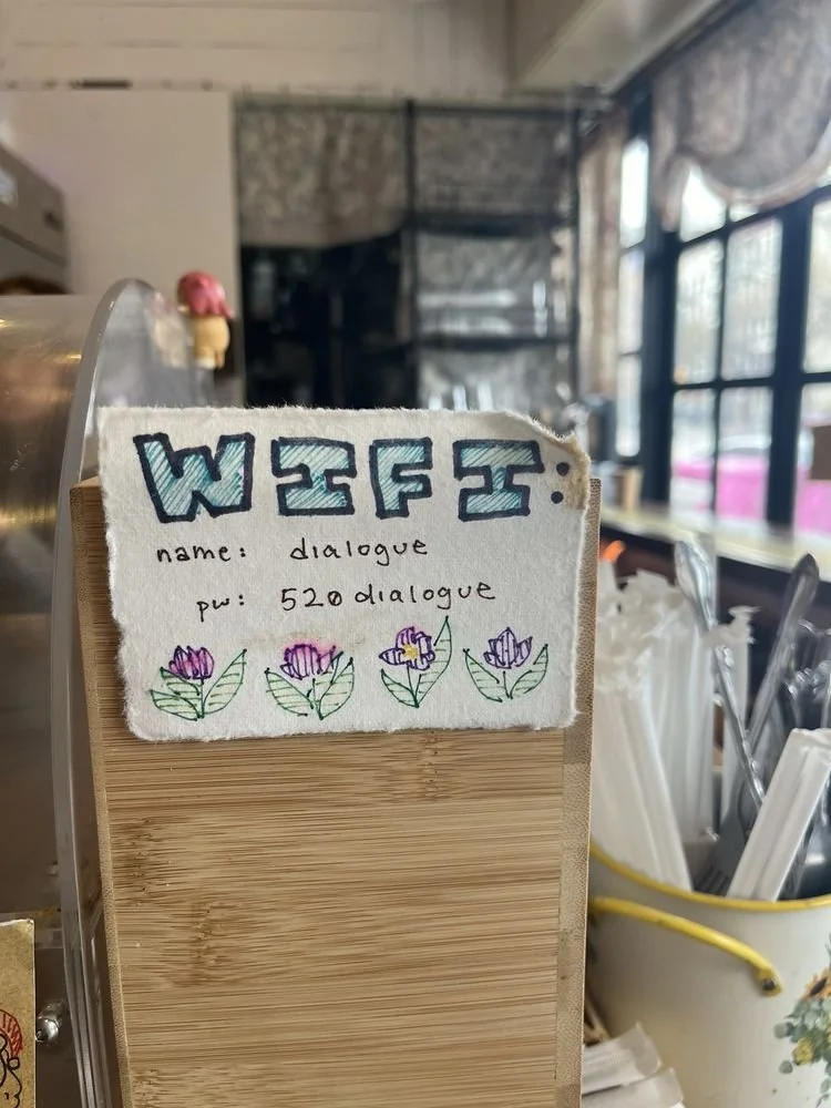
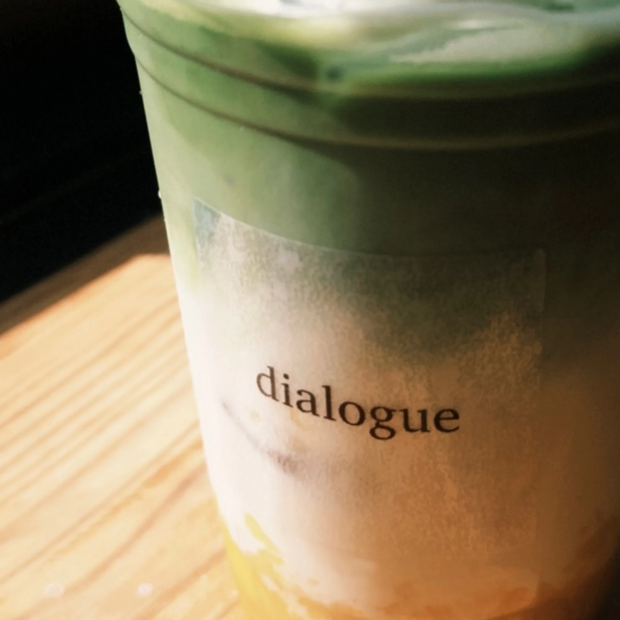
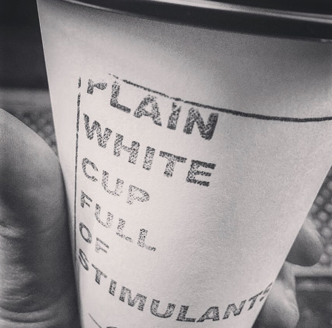
Dialogue Coffee and Flowers
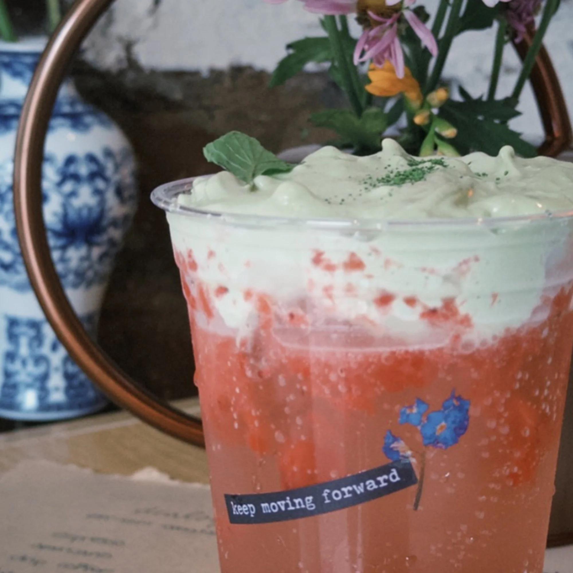
I simply love the concept of Dialogue Coffee and Flowers. Instead of branding their logo on the cups, they are using quote and flower stickers so each one feels special.
What a unique and beautiful idea.
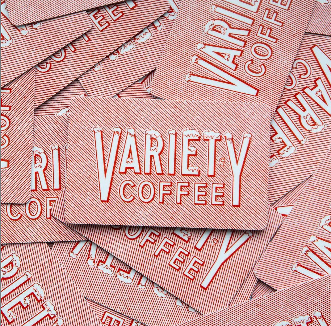
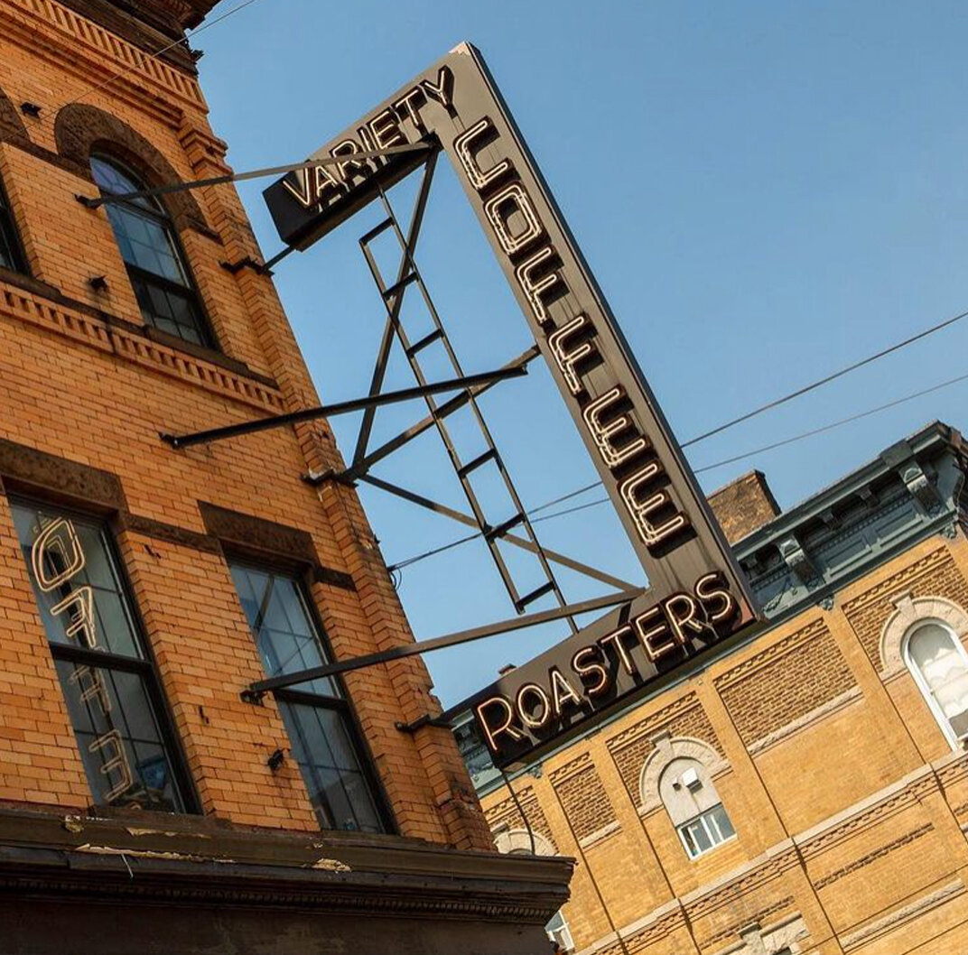
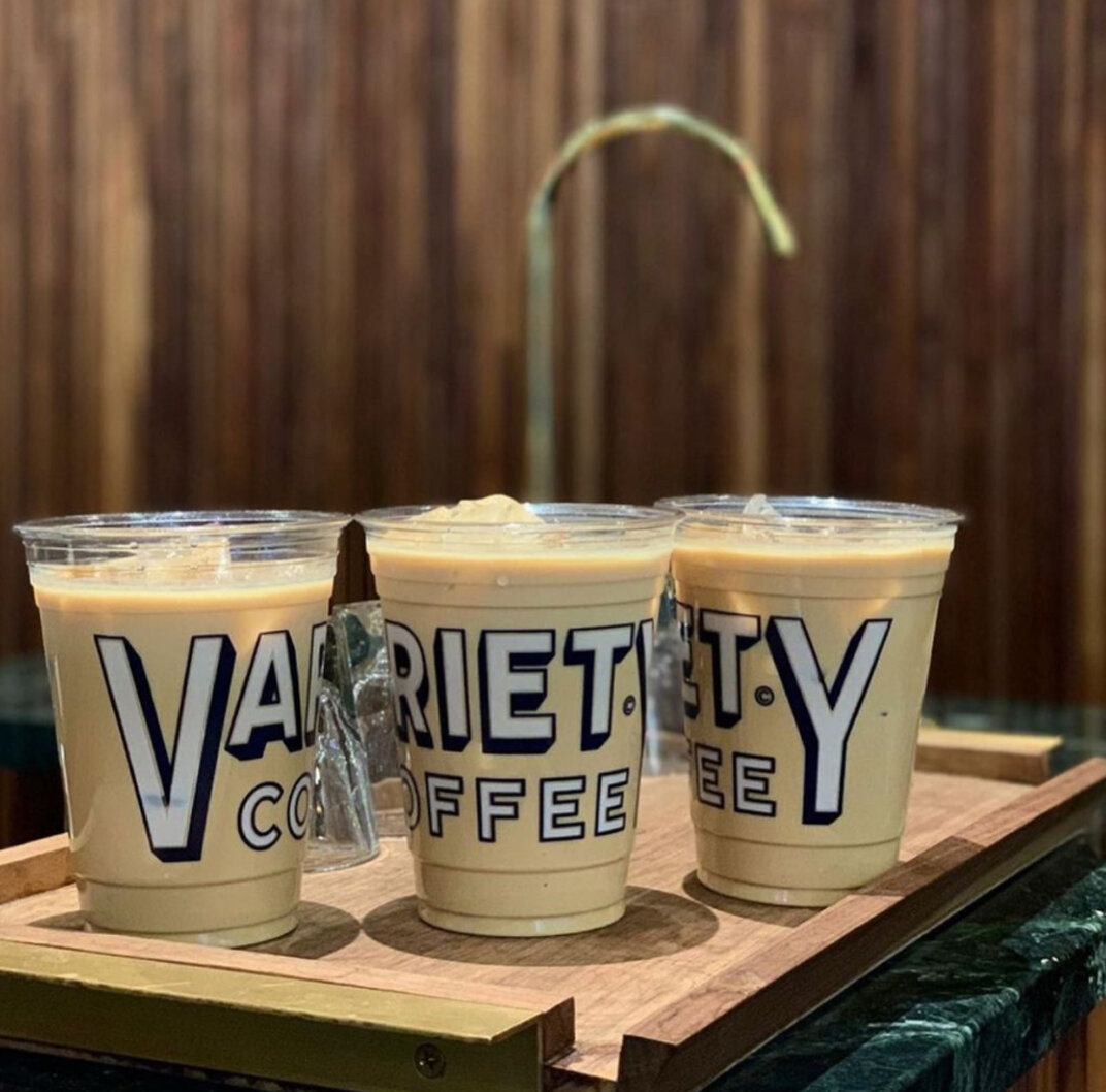
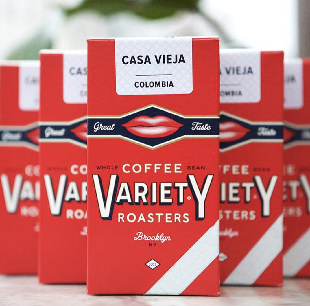
Variety Coffee Roasters
Designed by Derick Holt , this memorable identity for Variety Coffee Roasters has a vintage feel to it.
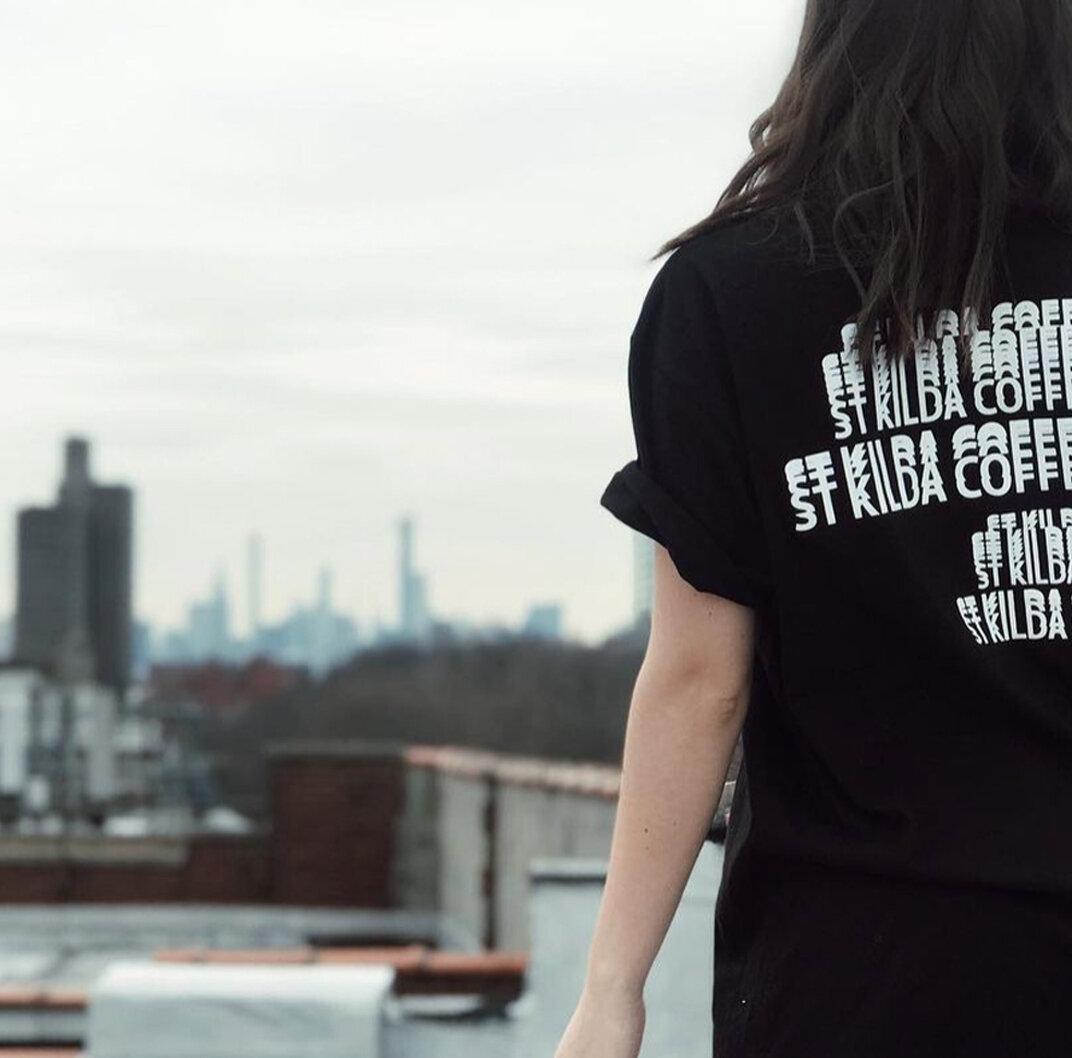
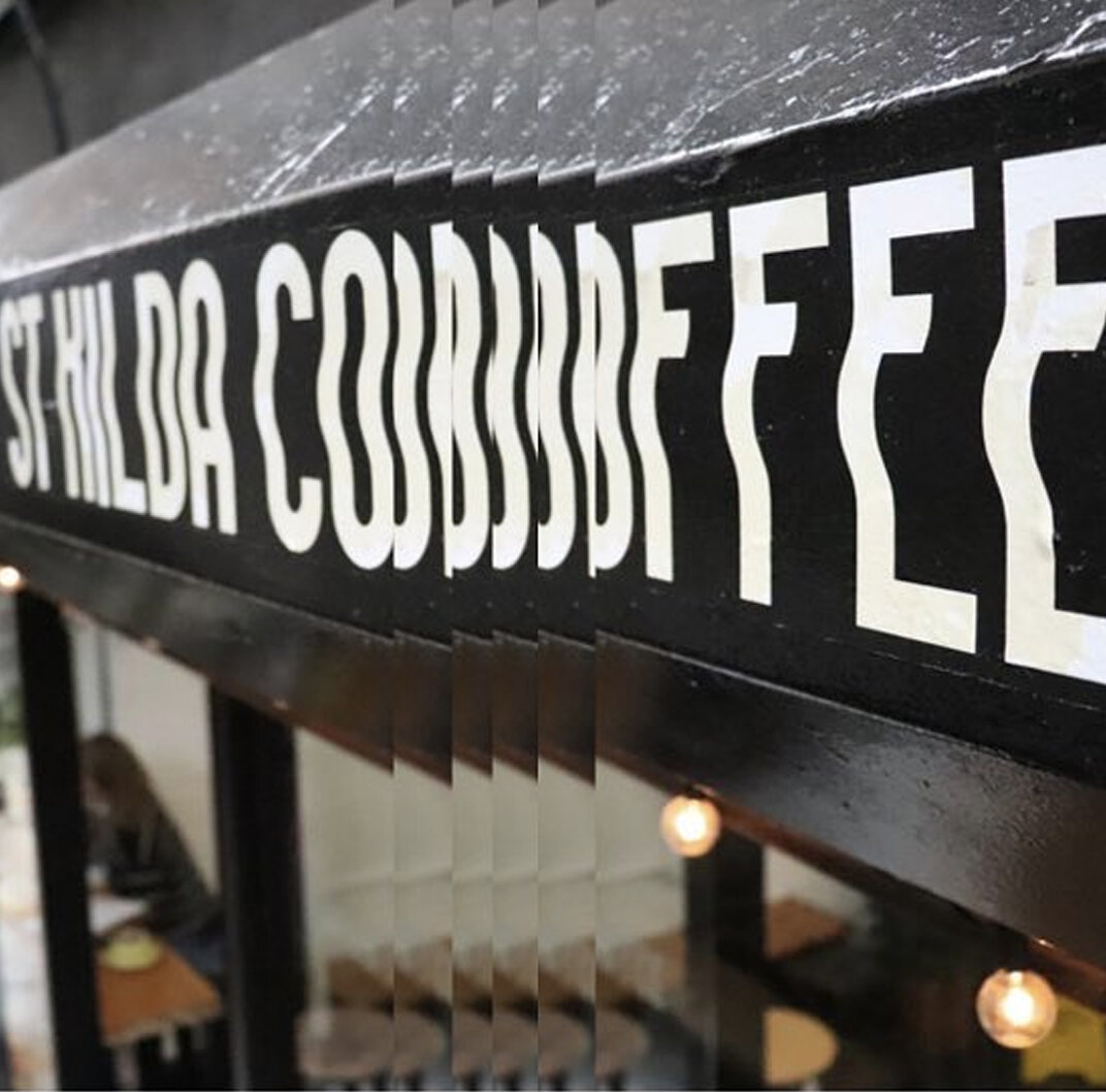
St. Kilda Coffee, Chelsea
I absolutely love this branding but I’m unable to find the designer. If you know drop a comment!
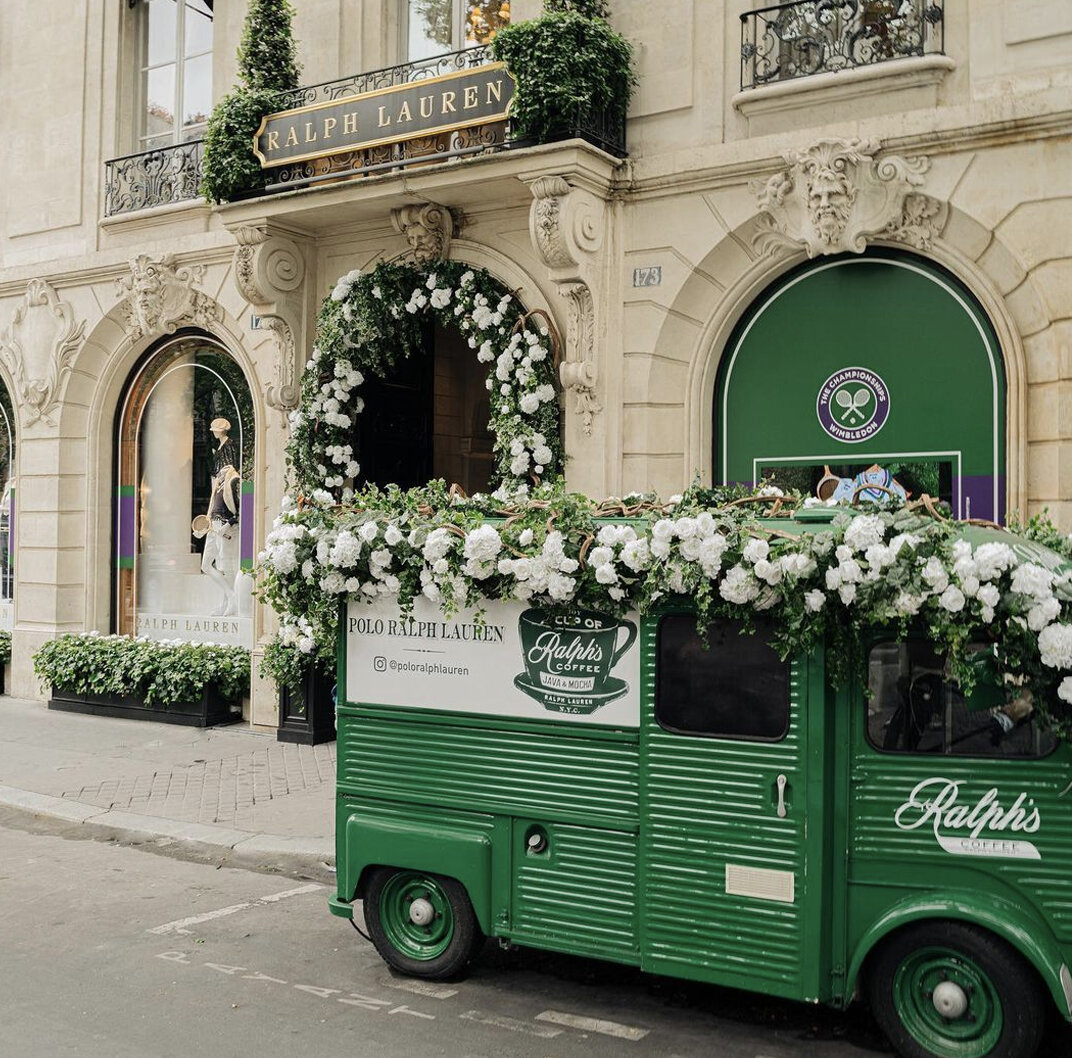
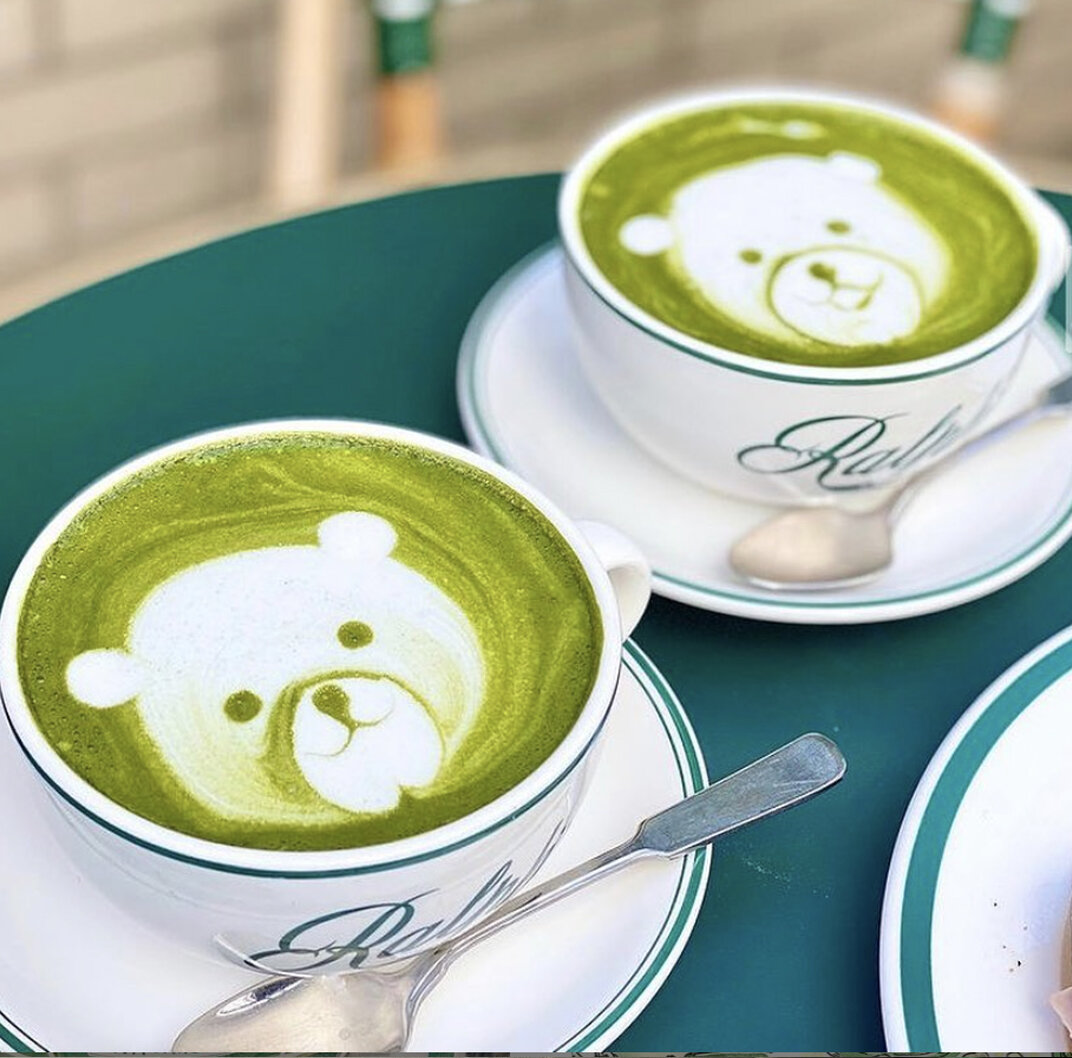
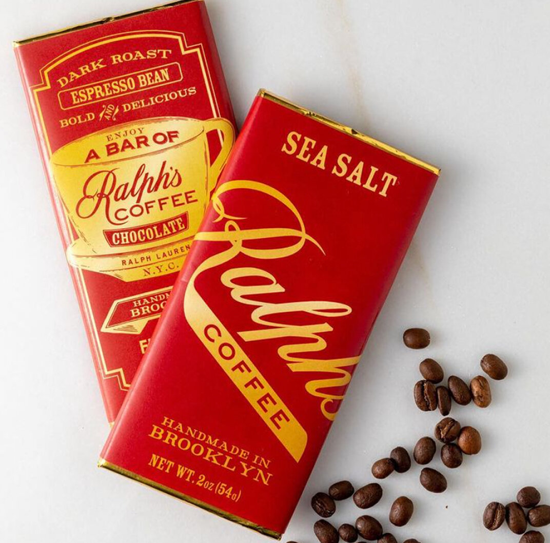
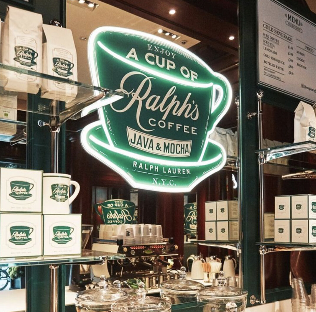
Ralph’s Coffee
Ralph’s coffee, a part of the Ralph Lauren store uses beautiful vintage type and a memorable color palette. Very classic Ralph Lauren. It was designed by Hunter Siegel and team.
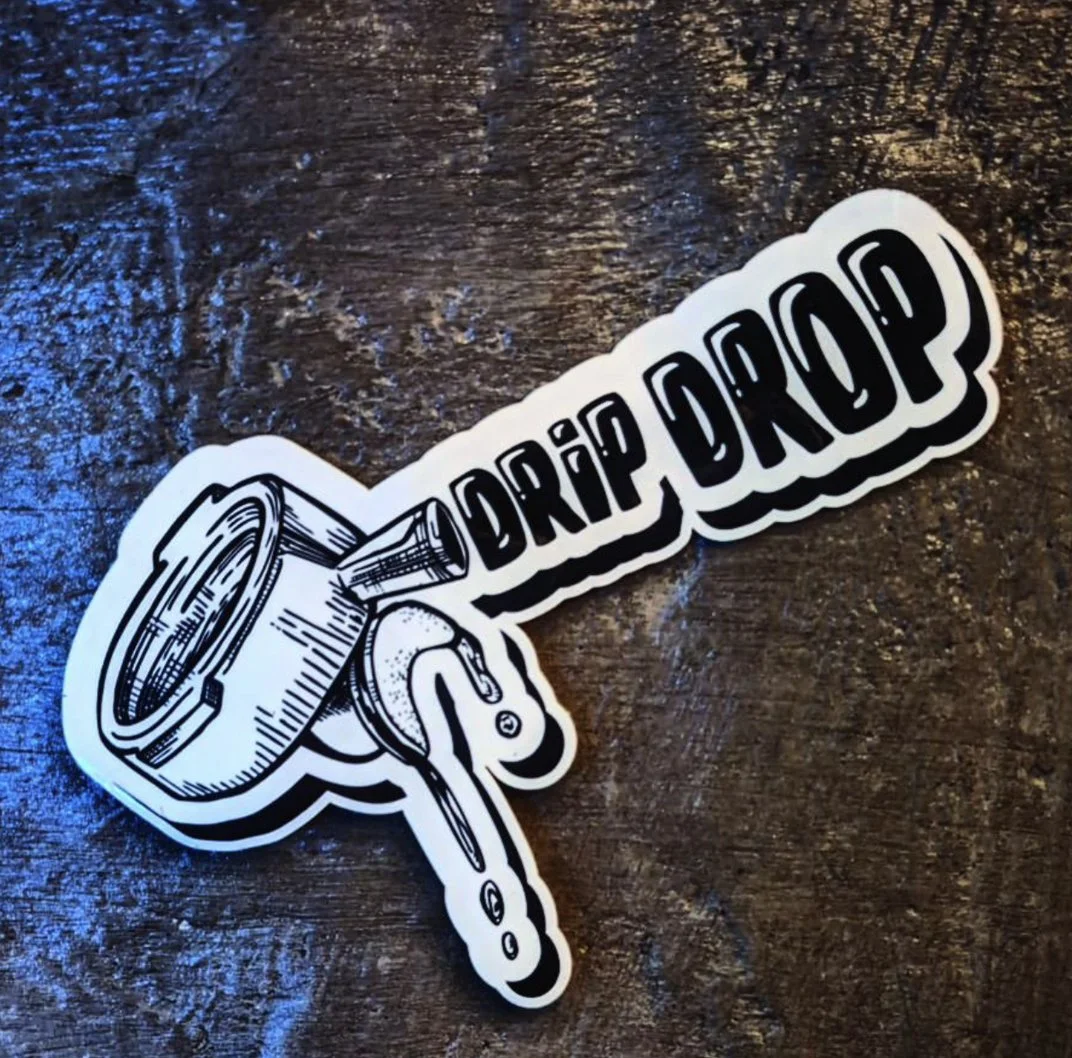
Drip Drop Cafe, SoHo
I can’t find the designer of this logo but it’s street art style sticker and photos are very cool. Check out more on their instagram.
Brooklyn Roasting Company
Loving how Brooklyn Roasting Company uses bold type and bright colors that gives off a uniquely 70’s NYC vibe. Jim Munson is the owner and a self-taught illustrator who designed the company logo in 2009.
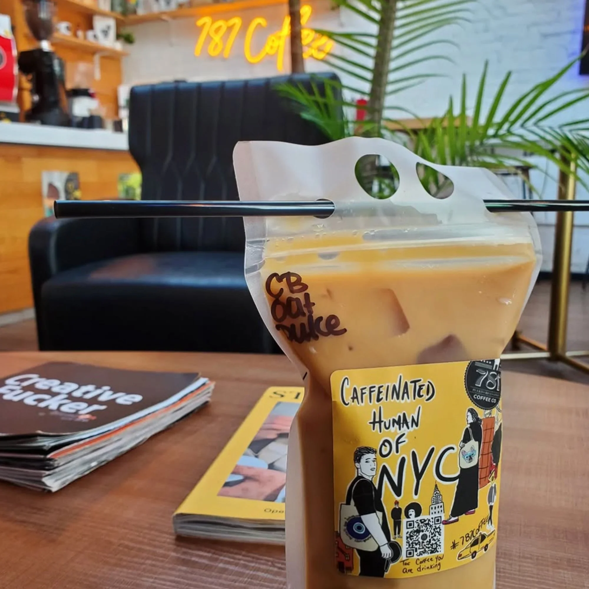
787 Coffee Company
787 Coffee Company is run by business duo Sam Sepulveda and Brandon Ivan Pena. The use of bold sharpie drawings on bright yellow cups stands out and brings a smile to your morning.
Matto Espresso NYC
This logo really stands out from the crowd by using a tarot card inspired design. “Matto” means crazy in Italian- a nod to the business’ crazy idea to offer $3 lattes.
It’s refreshing to see something different and maximalist. Unfortunately, I cannot find any information on the designer.

